Fountain pen ink guide
Share
Fountain pens are often celebrated as the epitome of elegance and timeless writing instruments. Their appeal goes beyond their design and craftsmanship; The type of ink used in a fountain pen plays a crucial role in determining the overall writing experience. In the world of fountain pens, there is a huge range of inks available, each with its unique set of characteristics. In this article we will explore the different characteristics of fountain pen inks.
- Variety of colors
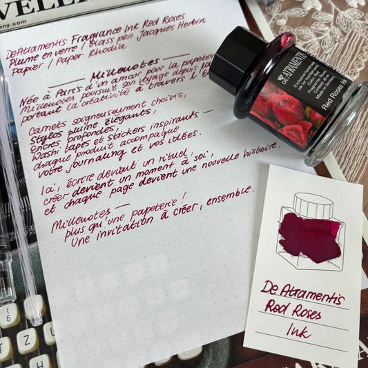
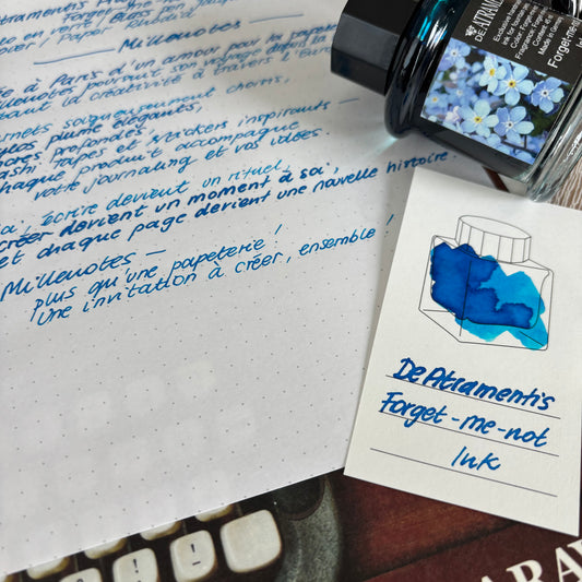
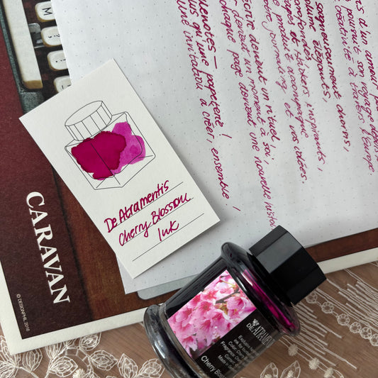
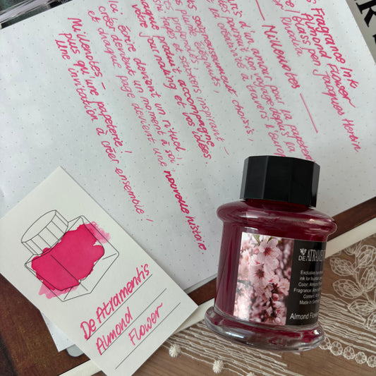
The most obvious characteristic of fountain pen inks is their color. Fountain pen inks come in a stunning variety of hues, from classic blues and blacks to vibrant reds, greens and even shimmering metallics. Ink color can have a profound impact on the mood of your writing, making it an exciting way to personalize your fountain pen experience.

- Saturation
Saturation refers to the vibrancy and intensity of the color on the paper. Highly saturated inks create bold, eye-catching lines, while less saturated inks can give a more subtle, delicate effect. This feature is crucial when choosing an ink for various writing purposes, such as official documents or artistic creations.
- Shading
Shading is the ability of ink to create depth and dimension in your writing. Some inks feature shading, where the color appears lighter in some areas and darker in others , adding a unique, artistic quality to your writing. This feature is highly sought after by fountain pen enthusiasts and artists.

In the photo at the top we see Kaweco black ink . This ink is the most standard, with no additional features. It is available in different colors. It will be perfect for lovers of classic solutions, also for professional use where you don't necessarily want to sign documents with glittering ink ;)
At the bottom we see the Jacques Herbin ink, Baltic Amber . This ink has a lot more depth and that's thanks to the shading. Personally I think that Jacques Herbin inks have the most gradient of all the inks I tested so if you like this characteristic, I advise you to test it! They are available in many different collections and colors!
- Double-shading
Some inks appear to be a mixture of two different colors that appear clearly separately on the paper, for example gray with a pink shadow (like Dominant Industry "Early Spring" ink) or purple ink with green highlights (like FWP ink "Poison Envy" ).


- Shine, radiance (eng. sheen)
Glow is a captivating characteristic found in some fountain pen inks. Sheen is often visible on certain types of paper and can add an attractive, almost metallic quality to your writing. High gloss inks are popular among those looking for a luxurious touch in their writing.
The shine is achieved due to the fact that the ink does not completely penetrate the paper, so there is always a layer of ink that can be easily smudged with fingers. So this could be considered a shine disadvantage. In my opinion, it all depends on the ink and also the quantity used. For example, even though Poison Envy has a lot of sparkle, I still use it daily to write in my planner and don't have any issues with ink stains (the lines are fine). However, when I used it for a painting (much more ink was used vs writing) and a few days later touched the ink, it stayed on my fingers. I would still definitely recommend trying the sparkle inks, they are so beautiful!
- Shine, glitter effect (eng. shimmer)
The glitter effect is one of your favorites. These inks contain tiny glitter particles . They can be the same color as the ink or a different color. The particles fall to the bottom of the bottle or settle at the bottom of the converter, so remember to shake the bottle or pen well before you start using them. If you use glitter inks often, remember to clean your pen well to avoid clogging. Personally, I recommend using these inks in pens that are at least size M (medium). Even though pen manufacturers allow you to use glitter inks even with an F (fine) nib, I personally think it's not worth the hassle. The pen may clog more often and you will be frustrated instead of enjoying the experience of writing with your beautiful ink.

In the photo you can see Jacques Herbin ink, Baltic Amber, without glitter particles (top) and Ferris Wheel Press glitter ink, Hearty Harvest (bottom). We clearly see the glitter particles in the Hearty Harvest. Both have a lot of shading.
- Drying time
Drying time is a practical consideration for fountain pen users. Some inks dry quickly, which is convenient for quick note-taking, while others take longer to dry, allowing for a smoother writing experience but requiring more patience. The choice depends on your specific needs and preferences. Drying time also strongly depends on the paper used.
- Water resistance
Water resistance is essential when the durability of your writing is crucial. Some inks are more water resistant, while others may fade or disappear completely. Water-resistant inks are often preferred for important documents and archival purposes.
- Diffusion and bleed-through
Diffusion is the tendency of ink to spread throughout the fibers of the paper, potentially blurring the lines of your writing.

The two inks used in the photo above are: Dominant Industry Les Falaises à Étretat and Jacques Herbin l'Ambre de Baltique. We can see very clearly here that despite the fact that we use the same paper, the intensity of the diffusion varies, it is more intense with Baltic Amber. This is related to the density and humidity of the ink. Personally, I don't feel this effect too often. You can limit it by using good quality paper.
Bleed-through occurs when ink passes through the other side of the paper . Quality fountain pen inks are designed to minimize these problems, but they can still vary in their performance. For me personally these two characteristics depend much more on the paper used than on the ink.
Fountain pen inks offer a world of options, allowing you to tailor your writing experience to your exact preferences and needs. Whether you're looking for vibrant colors, unique shading, or practical features like water resistance, there's an ink to suit your style. Exploring the myriad features of fountain pen inks can be an enjoyable experience in itself, as it adds a layer of artistry and personality to your writing. So the next time you pick up your fountain pen, consider ink choice as an integral part of your creative expression.
Is this information essential when choosing ink? I would say no. Very often we only find out when testing the ink. And the result depends on the paper and fountain pen used. It is therefore useful but not essential. However, I believe this information becomes very useful when selecting paper! J I therefore invite you to read a blog article that I created on this subject !













3 comments
Bonjour,
Peut-on utiliser n’importe quel stylo à plume quand on utilise les cartouches Jacques Herbin par exemple ?
Faut-il un outil particulier quand on prend des flacons ? Merci.
Quelles différences svp entre Les Essentielles (Vert Amazone est la seule que j’ai, et c’est splendide!!!) et La Perle de l’Encre chez Herbin? Les Essentielles semblent être plus pigmentées tout en étant plus fluides. Est-ce le cas? MERCI
Très informative merci beaucoup pour ce post !